 Charts
and Graphs
Charts
and Graphs

- DISPLAYING DATA:
-
- Tables, charts and graphs are convenient ways to clearly show your data.
Be sure to consider how to best show your results with appropriate graph
forms. You might want to consult with your science teacher. Be sure to give
your charts and graphs an appropriate title that explains what the data
measures. On line and bar graphs, the x and y axes must be appropriately
labeled with correct unit of measure (in metrics where applicable).
The easiest way to create a graph is to enter your data into a spreadsheet
program (Microsoft Works, ClarisWorks, Excel, etc.). These programs will
generate graphs from the data you enter. The examples of graphs included below
were done in Microsoft Works but could easily be replicated in any spreadsheet
program.
-
- There are three basic graph forms. The bar
graph, the line graph, and the circle
(or pie) graph. Notice how each of the following examples are used
to illustrate different kinds of data. Choose the best graph form to express
your results. Check out the Reminders
before leaving.
-
-
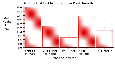
- A bar graph:
- A bar graph is used to show relationships between groups. The two items
being compared do not need to affect each other. It's a fast way to show
big differences. Notice how easy it is to see what was done in the
experiment below with bean plant growth and different brands of
fertilizer.
- A typical chart or table for this graph might look like this:
-
- Back to Top
-
-
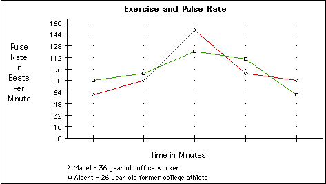
- A line graph:
- A line graph is used to show continuing data; how one thing is affected
by another. It's clear to see how things are going by the rises and falls
a line graph shows. This kind of graph is needed to show the effect of an
independent variable on a dependent variable. In the sample below, the
pulse rate of a person is shown to change over time. As time continues,
the pulse rate changes.
- A typical chart or table for this graph might look like this:
-
-
- Back to Top
-
-
- A circle (pie) graph:
- A circle graph is used to show how a part of something relates to the
whole. This kind of graph is needed to show percentages effectively.
- A typical chart or table for this graph might look like this:

-
-
- Back to Top
-
-
- Reminders:
- 1. All measuring is to be done accurately and consistently using metrics
where applicable.
- 2. Keep a detailed daily record or log book for measurements, changes
and problems.
- 3. Take photographs, make diagrams or drawings of various phases of your
experiment.
- 4. Observations and measurements should be organized in tables or charts
that are clearly labeled.
- 5. Results should be graphed using one of the three methods described
above.
- 6. Don't become discouraged; work diligently and repeat an experiment,
if necessary.
-
- Back to Top
-
Authors: Dr. Marszalek , Mrs. Delli Paoli, Mrs. McMullen, Mrs. Mazanek ,
Mrs. Mohr
School: Twin Groves Middle School, Buffalo Grove, Illinois 60089
Created: 15 June 1997; Modified: 14 January 2003